Guide
Design context for AI coding
AI coding output improves when the input describes the subject, the audience, and the visual rules that matter. That is the role of DESIGN.md in MoStyle.
Guide
Why this page exists
Give AI coding tools a clearer design context so they can reproduce a visual system without inventing extra structure.
Related pages
Continue exploring the catalog
These links keep the learning path close to the actual catalog pages.
Example designs
Published templates that match the workflow
Use these public templates as concrete examples when you are deciding what to download.
Landing page + Admin panel + Frontend app
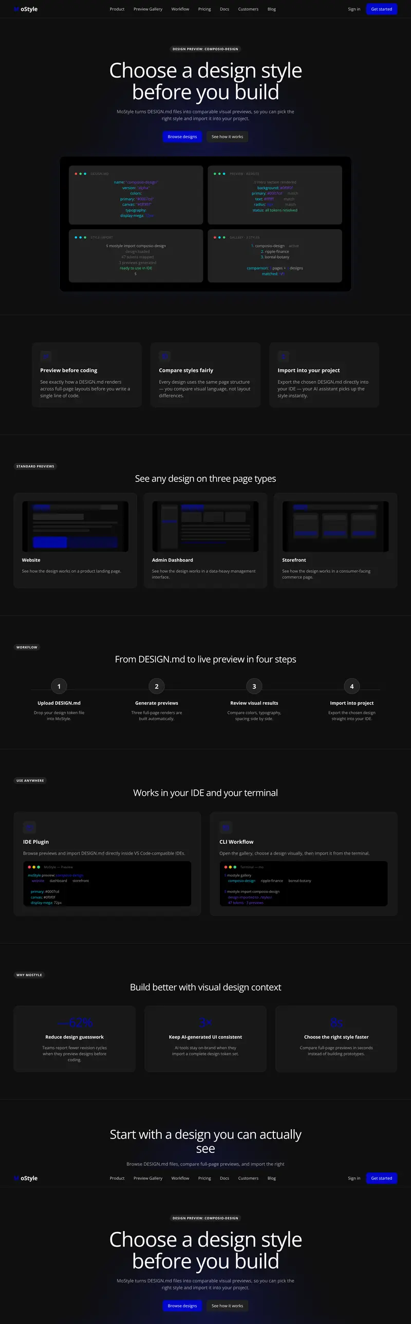
Composio style reference
This precise alignment and clean geometry UI template is built for product teams creating settings screens, landing pages, and content libraries. It pairs public previews with a downloadable DESIGN.md so the same visual system can move from browsing into implementation.
Landing page + Admin panel + Frontend app
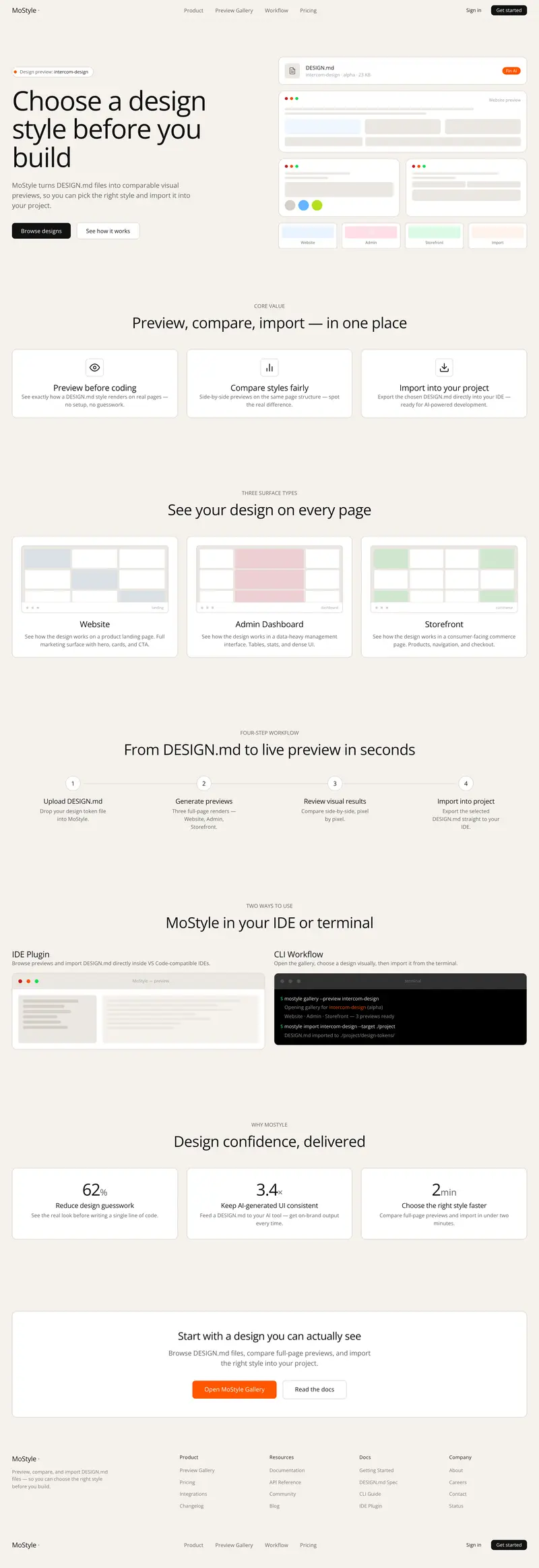
Intercom style reference
This bold navigation and tactile panels UI template is built for product teams creating pricing pages, workspace apps, and mobile product screens. It pairs public previews with a downloadable DESIGN.md so the same visual system can move from browsing into implementation.
Landing page + Admin panel + Frontend app
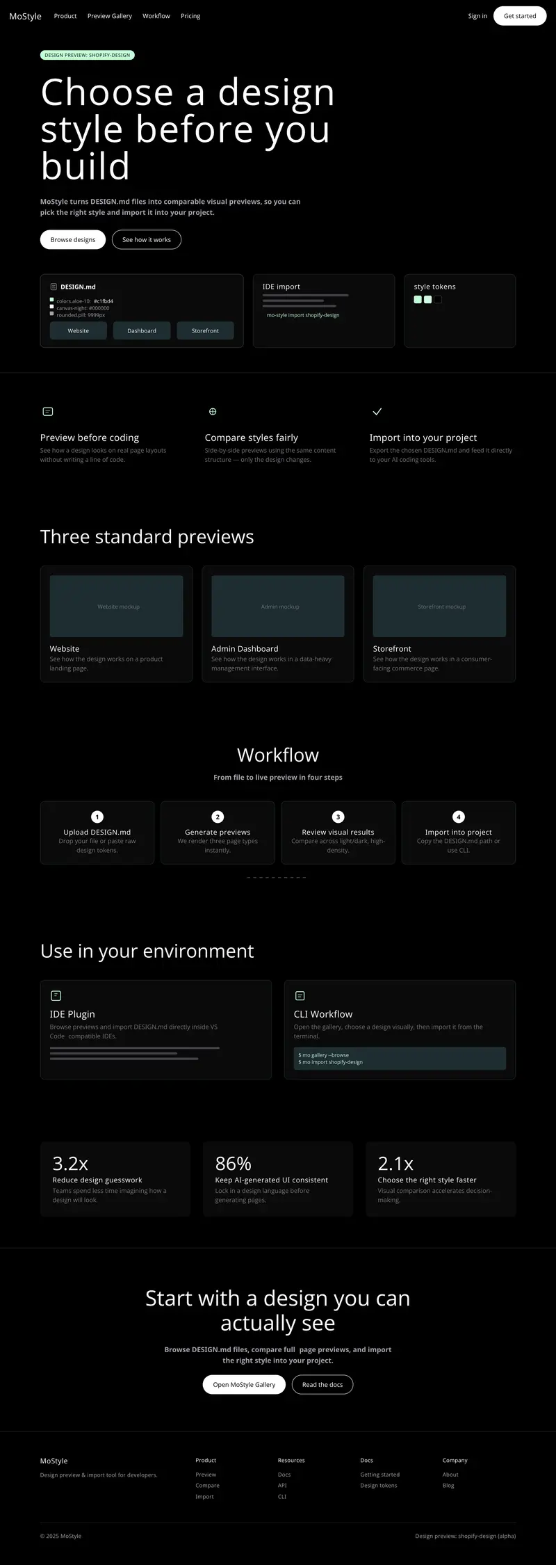
Shopify style reference
This calm spacing and focused call-to-action flow UI template is built for growth teams creating landing pages, mobile product screens, and content libraries. It pairs public previews with a downloadable DESIGN.md so the same visual system can move from browsing into implementation.